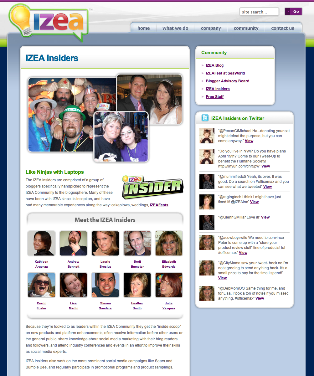
Today IZEA launched its new website and I am really excited. Why? Because the redesign was way overdue. The old site was built in a few days and had no content management system… not to mention that it wasn’t the prettiest thing IZEA has ever put out. I am also excited because I designed the site myself. It was the second WordPress site that I personally created all design elements for and I am very happy with the outcome (ted.me was the 1st). Adam did a kick ass job coding it and the team helped me fill in the content holes. What do you think?
Be sure to stop by the Ted Murphy page and leave me some love.


Nice work Ted and team!
First of all… that new look is awesome.
Second… the fact that it is all built on wordpress is awesomer.
Third… the fact that the picture you used to show it on this post is the Izea Insider page is the awesomest!!!
It is amazing, I love how integrated the whole site is. I love how pages look like posts and you can easily comment everywhere. That is great for communication and interaction.
[…] we are so excited about the latest relaunch of the IZEA.com site. The entire site was designed by IZEA CEO Ted Murphy. Ted knows how to design. The site is a wordpress blog but you’d never know because it is so […]
Ted, the site looks great – and I’m just as proud as punch to be part of the whole IZEA awesomeness 🙂
I’m all-but-obsessed with our new company website – I just can’t stay away from it!